Salesforce has several “out-of-the-box” dashboards that help teams understand adoption and operational health. These dashboard packs are often installed, reviewed once, and then forgotten — even though the underlying pattern is extremely reusable.
This post explains what Adoption and Data Quality dashboards are (at a high level), then focuses on the part that creates long-term value: reusing the same score-and-reasons model to build a scalable Data Quality framework using formula fields — not just for standard objects, but for custom objects too.
Install links (Salesforce AgentExchange)
What are “Adoption” dashboards?
Adoption dashboards are designed to answer questions like:
- Are users consistently logging in and using the system?
- Are key objects being created and updated as expected?
- Are teams following standard processes (stages, statuses, required steps)?
In other words, they measure usage and behaviour, not just record counts.
What are “Data Quality” dashboards?
Data Quality dashboards focus on the completeness and usability of your data. Most dashboard packs summarize:
- How many records are “complete” vs “incomplete”
- What’s missing most often (e.g., email, phone, classification fields)
- Who owns the incomplete records (so cleanup is assignable)
They’re popular because they create simple visibility: what’s wrong, how bad it is, and who should fix it.
The reusable pattern underneath: Score + Missing Reasons
The free Data Quality Analysis Dashboards (Salesforce Labs) use the same foundational model on each object:
- Data Quality Score — a numeric score (typically 0–100)
- Data Quality Description — a readable “Missing: …” explanation
Once those two fields exist, everything else becomes easy:
- Score distribution (how many records are perfect vs incomplete)
- Top missing reasons (group by the description)
- Low quality by the owner (who needs to fix the data)
This is the real value: the dashboards are only the “skin” — the score and missing reasons are what make it scalable and actionable.
Benefits (why this works so well)
- Find issues quickly: instead of guessing what’s wrong, teams get a prioritized view of incomplete records and the top missing fields.
- Make cleanup actionable: the “Missing: …” text tells users exactly what to fix without requiring them to search through page layouts.
- Drive accountability: “Low quality by owner” views help managers assign ownership and track improvement over time.
- Reduce reporting noise: once data is consistently populated, downstream reports, dashboards, and analytics become more reliable.
- Scale to any process: the same pattern can be applied to standard objects, custom objects, and packaged objects.
Why updating the formula fields is the real implementation work
Out of the box, Salesforce Labs dashboards use generic completeness checks that may not reflect your business. Different organizations care about different definitions of “good data.” For example:
- A sales team may care about lead source, stage hygiene, and contactability.
- A service team may care about case classification, priority, and timeliness.
- A revenue team may care about product, pricing, and renewal fields.
Instead of rebuilding dashboards from scratch, the fastest approach is usually:
- Keep the dashboard pack and reports
- Replace the Score and Description formulas so the pack measures what your business needs
- Adjust report filters to match your data model (record types, statuses, populations)
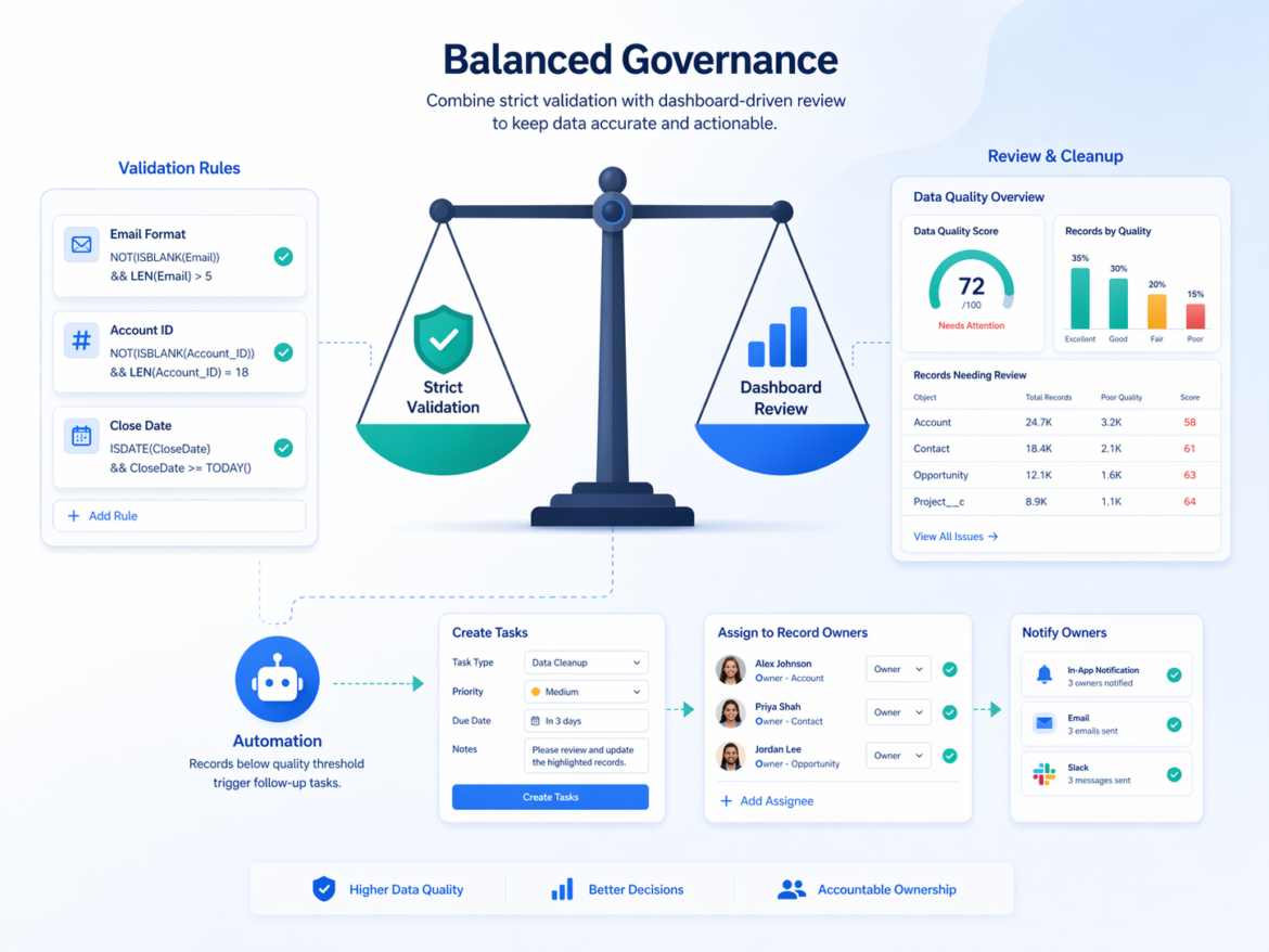
Balance: dashboard-driven review vs overusing validation rules
Validation rules are powerful, but overusing them can create friction:
- Users can’t save progress if every field is required immediately.
- Processes that span multiple steps (or multiple teams) become difficult to manage.
- Integrations and data loads can fail if they don’t populate every required field.
A practical approach is to create a balance:
- Use validation rules only for true “must-have” fields that block downstream processing or compliance.
- Use data quality scoring for everything else: it highlights gaps without preventing work from moving forward.
- Review and improve via dashboards and owner-based queues — especially during rollout, migrations, or process changes.
This helps teams stay productive while still driving data governance.
How to reuse the pattern for custom objects (the real unlock)
Most out-of-the-box packs cover only a handful of standard objects. Real orgs rely heavily on custom objects (and often packaged objects too). The good news is the pattern still works perfectly.
Step 1: Add two fields to the object
- Data_Quality_Score__c (Number formula)
- Data_Quality_Description__c (Text formula)
Step 2: Define what “complete” means for that object
Choose the fields that represent operational completeness for that process. Examples:
- Workflow objects: status, owner, due date, next step
- Customer objects: contactability, classification, required identifiers
- Transactional objects: product, amount, stage, dates, outcomes
Step 3: Implement a weighted score (0–100)
- Keep it simple: 100 points total
- Assign fixed weights per requirement (10, 15, 20, etc.)
- Award points only when the field is populated/valid
Step 4: Build the “Missing: …” explanation
Concatenate missing requirements into a readable string. This one field becomes your best “actionability” feature: it tells users exactly what to fix.
Step 5: Build three core reports per object
- Score Distribution (bucket score into 100 / 70–99 / <70)
- Top Missing Reasons (filter score < 100, group by description)
- Low Quality by Owner (filter score < 100, group by owner)
Example: Score + “Missing Reasons” formula fields
The dashboards are powered by two fields on each object:
- Data_Quality_Score__c (Number formula) — returns a score from 0 to 100
- Data_Quality_Description__c (Text formula) — returns a readable “Missing: …” string
Below are generic examples you can adapt to your business rules.
Example 1: Account
Data_Quality_Score__c
/* 100-point weighted score (example) */
IF(ISBLANK(Phone), 0, 25) +
IF(
  OR(
    ISBLANK(BillingStreet),
    ISBLANK(BillingCity),
    ISBLANK(BillingPostalCode),
    ISBLANK(BillingCountry)
  ),
  0,
  35
) +
IF(ISPICKVAL(Industry,""), 0, 20) +
IF(ISPICKVAL(Type,""), 0, 20)
Data_Quality_Description__c
IF(
  Data_Quality_Score__c = 100,
  "All Account Details Captured",
  "Missing: " &
  IF(ISBLANK(Phone), "Phone, ", "") &
  IF(
    OR(
      ISBLANK(BillingStreet),
      ISBLANK(BillingCity),
      ISBLANK(BillingPostalCode),
      ISBLANK(BillingCountry)
    ),
    "Complete Billing Address, ",
    ""
  ) &
  IF(ISPICKVAL(Industry,""), "Industry, ", "") &
  IF(ISPICKVAL(Type,""), "Type, ", "")
)
Example 2: Contact
Data_Quality_Score__c
/* 100-point weighted score (example) */
IF(ISBLANK(Email), 0, 25) +
IF(AND(ISBLANK(MobilePhone), ISBLANK(Phone)), 0, 25) +
IF(
  OR(
    ISBLANK(MailingStreet),
    ISBLANK(MailingCity),
    ISBLANK(MailingPostalCode),
    ISBLANK(MailingCountry)
  ),
  0,
  25
) +
IF(ISBLANK(Title), 0, 25)
Data_Quality_Description__c
IF(
  Data_Quality_Score__c = 100,
  "All Contact Details Captured",
  "Missing: " &
  IF(ISBLANK(Email), "Email, ", "") &
  IF(AND(ISBLANK(MobilePhone), ISBLANK(Phone)), "Phone/Mobile, ", "") &
  IF(
    OR(
      ISBLANK(MailingStreet),
      ISBLANK(MailingCity),
      ISBLANK(MailingPostalCode),
      ISBLANK(MailingCountry)
    ),
    "Complete Mailing Address, ",
    ""
  ) &
  IF(ISBLANK(Title), "Job Title, ", "")
)
Example 3: Custom object (Project__c) — same pattern, different fields
Here’s what it looks like on a custom object (replace field names to match your org).
Data_Quality_Score__c
/* 100-point weighted score (example) */
IF(ISPICKVAL(Status__c,""), 0, 25) +
IF(ISBLANK(OwnerId), 0, 15) +
IF(ISBLANK(Customer__c), 0, 25) +
IF(ISBLANK(Requested_Amount__c), 0, 20) +
IF(ISBLANK(Due_Date__c), 0, 15)
Data_Quality_Description__c
IF(
  Data_Quality_Score__c = 100,
  "All Project Details Captured",
  "Missing: " &
  IF(ISPICKVAL(Status__c,""), "Status, ", "") &
  IF(ISBLANK(OwnerId), "Owner, ", "") &
  IF(ISBLANK(Customer__c), "Customer, ", "") &
  IF(ISBLANK(Requested_Amount__c), "Requested Amount, ", "") &
  IF(ISBLANK(Due_Date__c), "Due Date, ", "")
)
Tip: Keep your first version simple. You can always evolve the model later with conditional scoring (e.g., “Loss Reason only required when Closed Lost”) and automation (e.g., create Tasks when score < 70).
Turning the framework into actions (Tasks, notifications, and follow-ups)
Once scoring is in place, you can evolve from “visibility” to “execution.” A common next step is to automatically create follow-ups when data quality is below a threshold.
Examples:
- Create Tasks when a record’s score drops below 70, assigned to the record owner.
- Create Tasks only for specific gaps (e.g., missing email, missing classification), so work stays targeted.
- Escalate aging issues (e.g., low-quality records that haven’t improved in 30 days) to a manager queue.
- Weekly digest emails or Slack notifications summarizing low-quality records by owner.
These can be implemented using Flow, scheduled automation, or existing orchestration tools — while keeping the score/description fields as the source of truth.
Other improvements worth considering
- Use score bands consistently: for example, 100 = Green, 70–99 = Yellow, <70 = Red. This keeps dashboards consistent across objects.
- Use conditional scoring: require certain fields only in certain stages/statuses (e.g., “Loss Reason” only when Closed Lost).
- Exclude irrelevant populations: filter out archived/test records, or exclude records that are not in scope for active operations.
- Governance ownership: create a recurring meeting or monthly KPI for “data quality improvement” so the dashboard becomes operational.
- Protect performance: keep formulas readable and avoid overly complex logic; use reports to slice and prioritize work.
Applying the same pattern to any Salesforce Cloud (Revenue, Financial, Service, and more)
This framework isn’t tied to one industry or cloud. The same Score + Missing Reasons pattern can be applied to any Salesforce implementation by swapping the “required fields” to match your process.
- Sales Cloud / Revenue Cloud: stage hygiene, close dates, products/pricing, renewal fields, quote completeness
- Service Cloud: case classification, priority, SLA/timeliness, routing/ownership, resolution outcomes
- Financial Services Cloud: customer verification, regulatory attributes, relationship/account coverage, consent preferences
- Health Cloud: care plan completeness, program enrollment, patient contactability, consent and pathway fields
- Any custom solution: onboarding, projects, approvals, audits, compliance workflows
In every case, the steps are the same:
- Define “complete” for your process
- Encode it in two formula fields
- Reuse the same three reports and dashboard pattern
Practical gotchas (so you don’t get stuck)
- Long Text Area fields can’t be evaluated with
LEN()orISBLANK()in formula fields. Prefer short text fields or picklist-based checks. - Duplicate detection (like duplicate email) can’t be done in a formula because formulas don’t scan other records. Use Matching Rules + Duplicate Rules and report on duplicates separately.
Conclusion
Salesforce dashboard packs are more than dashboards — they’re a reusable implementation pattern. By focusing on the Data Quality Score and Data Quality Description formulas, you can transform a generic pack into a business-specific data quality framework and extend it to any object in the org, standard or custom.
That’s how dashboards become operational — not just informative.